
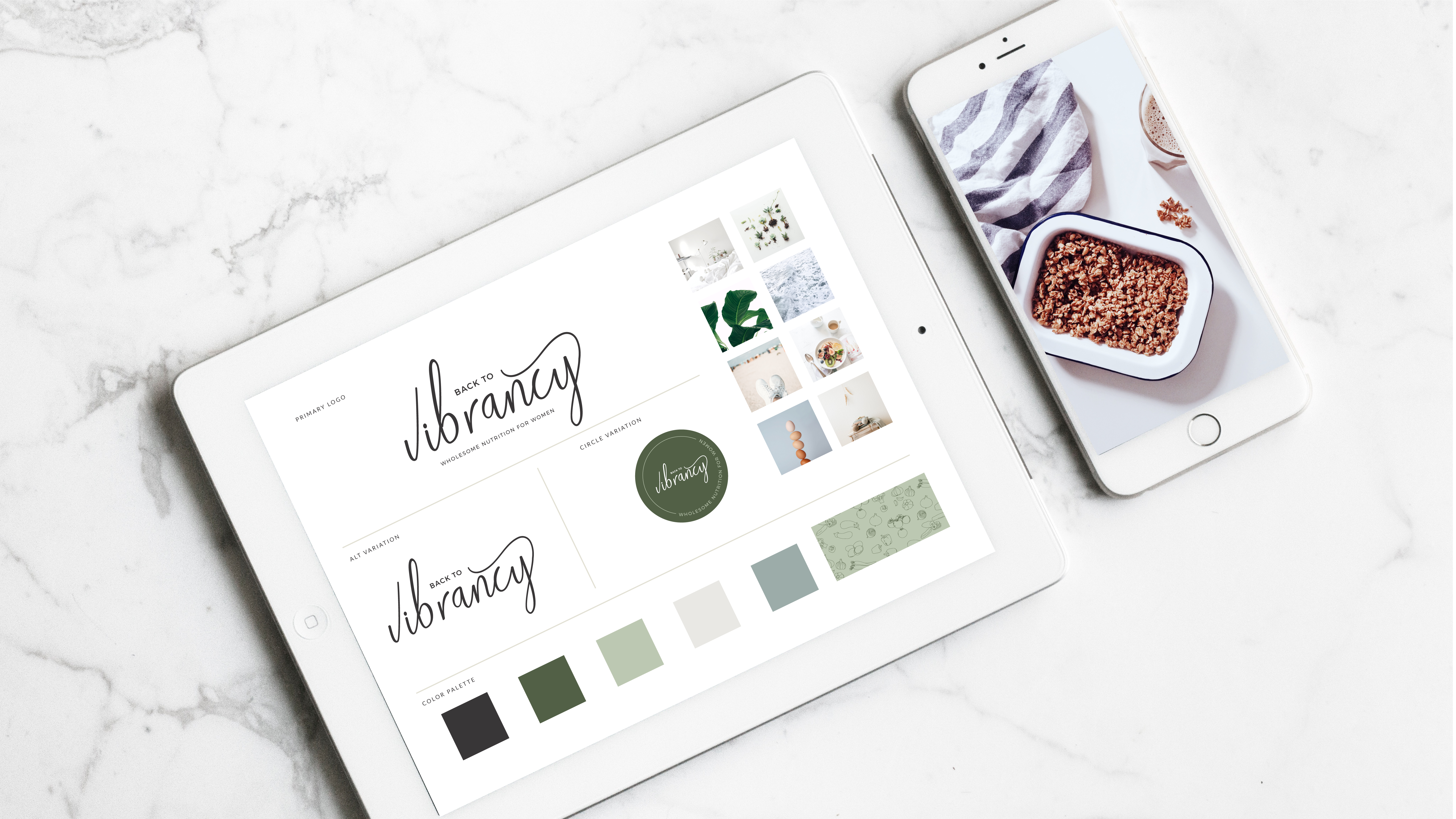

Picking the right fonts for your website can be detrimental to turning viewers into readers and readers into paying clients. Although seemingly minute, fonts that are too busy, difficult to read, don’t compliment each other or don’t portray the right personality, can quickly turn away a client that might really need your services.
In the blog post, I’m sharing the 5 Rules to Live when choosing fonts for your website to ensure that your website is easy to read, exciting and converts. Before we get started, next month I’m launching a DIY Website Design Course and we will be going way farther in depth with this. Get on the waitlist here to make sure you get the discount when it comes out!
01. Complementary fonts
When choosing fonts for your website, you want to consider the context in which they’ll be used and the vibe of your brand. Playful, elegant, fun, professional, minimal are all personalities of fonts that can be used so you want to make sure you choose what complements what you’re going for. For example, a really cute script font gives off a fun and friendly vibe that would be great for an online coach, but not a law firm.
Think about the tone of your brand by picking 5-10 words that describe the personality of your brand and how you want your ideal customers to feel when they get to your site.

02. Visual Hierarchy
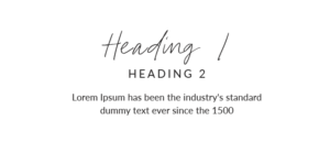
Establishing a visual hierarchy is super important to making your website easy to follow and consistent throughout your site. Typically, you’ll have a Heading 1, Heading 2, Heading 3 and a paragraph which will allow you to pick fonts and then use them consistency throughout your site. SquareSpace makes this extremely easy as you can edit the headings in your design tab and then it changes the whole site. If you’re using another site that has more leeway like Showit or Wix, you want to make sure you pick your visual hierarchy and then stick to it.
If you choose a display font as your heading (i.e. script, extra bubbly or with exaggerated serif), you want to make sure you pick a simpler font that compliments the heading so it doesn’t look too busy. Establishing a hierarchy is how you can direct your readers easily to where their eyes should go to first, second and then third on the page.
03. Mix it up
Opposites attract! Try not to pick fonts that are too similar in size, height or weight so they are all mixed together. Pair a thick sans serif font with a nice serif font or a tall thin font with a script font to create a contrast and give your readers something to look at!
04. Fonts from the same family
Picking fonts from the same family is a great way to ensure readability, but you have to be careful not to choose ones that are too similar. When picking fonts from the same family be sure to choose ones that have a lot of contrast such as, thin, regular, medium, bold and uppercase, italicize and lowercase.
If picking out fonts is extremely painful for you (like a lot of people!), then choosing fonts from the same family can make the process a lot more streamlined. If this is you – don’t worry, below is an example of a Roboto Condensed font hierarchy you can use on your website.
Hint: If you want to mix it up just a wee bit, add a script font as the heading.

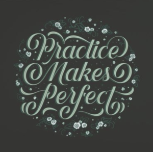
05. Practice
Practice practice practice! You’ll have to go through a few rounds of font pairings until you feel that you have it right! Make a new sheet on canva and practice creating your hierarchy until you have a few times. Google fonts are the most common fonts that are used on websites, so to make sure you’re always consistent, try to stay within those fonts.
As with every skill, the more you practice, the better you’ll get! Look at your website and see if you follow your page just how you like it. If not, change up the fonts!
* Bonus: Avoid thin fonts
Sometimes on websites I see super thin fonts as the paragraph fonts and it makes it really difficult to read. It’s a common debate about whether sans serif or serif fonts are easier to read, but either way, avoid thin fonts on screens. Especially since a lot people read on their phones nowadays, you don’t want the font to be small and thin.
I hope this way helpful for you when it comes to DIY-ing your website and picking fonts that complement your brand and make your website fun and easy to read. If you missed last week’s blog post, I shared how to create a color palette for your website, so after applying both of these tips, you’ll have a beautiful website!
Did you apply what you learned in this blog post? Share it on Instagram so I can see! Have questions? Shoot me an email at olivia@currentdesignstudio.com and I’ll help you the best I can.

March 4, 2019
