Color is extremely important when it comes to your brand because it is commonly what the first impression of your business is based on. Colors are not just “colors”; they convey emotion, feelings and experiences associated with your brand. When you choose the right colors that align with the personality of your business, you’re able to attract the clientele you want and portray the personality of your brand (and you!).
Although colors hold different meanings for everyone, it’s important to consider the tone you are trying to project to your potential customers before randomly picking colors you like. What if Target hadn’t chosen Red? Or Whole Foods hadn’t chosen green? ThePsychology of color, although often overlooked, is extremely important when building your brand.
In this article, I’ll be sharing the meanings of each color, the 3 steps to take to create your color palette and how to use them on your website.
**P.S. next week I’ll be sharing how to choose fonts for your website, so be sure to join the Current Community to get this delivered straight to your inbox 🙂
Yellow
 Yellow! Such a joyful color that radiates a ton of positivity and sunshine (duh). Yellow signifies communication, enlightenment, sunlight, spirituality, creativity and cheerfulness.
If your brand is about creating a positive experience, yellow is definitely a color to add to your palette.
Blue
 Blue is a universal color that is widely loved by many people. Each shade of blue can hold a different meaning, which allows it to be unique and versatile.
Different shades of blue can be associated with creativity, authenticity, calmness. enthusiasm, sympathy, spirituality, intelligence, relaxation.
Green
 Green is a color that symbolize renewal and growth. Typically a color that is associated with nature, development, “down to earth”.
Green is often associated with energy, understanding, health, growth, calmness, balance, inner energy.
Purple
 Purple is creating with red and blue and is the perfect combination of both of them. If you think of psychology of color, purple, in essence, balances the two out. Where red is intensive and aggressive, blue is calm and relaxing and purple brings out the best of both of them.
Purple is commonly associated with luxury, femininity, wisdom, dignity, royalty, mystery, magic, creativity.
Red
 Red is a color that commands a lot of attention and is easily noticed. A lot of big box use red as a dominant color because it attracts attention in marketing material, ads and as a street sign.
Think of Target, Trader Joe’s, Supreme, K Mart, Coca Cola, etc.
Red is commonly known for energy, passion, love, desire, danger, power and determination – all personalities that command a lot of attention to your potential client.
Orange
 Orange is a combination of red and yellow and definitely brings both of their personalities into its color. Although orange isn’t as popular of a color used for branding (I think of Home Depot), it’s a vibrant and cheerful color that will absolutely help you to stand out.
Orange is often associated with enthusiasm, optimism, positivity, courageous, sociable, passionate (but not as aggressive as red).
Brown
 Brown evokes a sense of strength and reliability and is commonly associated with nature (earth). Although brown isn’t a super common color, using different shades of brown can create a very calming and “down to earth” presence to a brand.
Brown can be associated with security, resilience, dependability, healing, home, grounding, warmth, foundation,
Black
 Black is generally associated with a sophisticated, mysterious style. It is a serious color that can bring out a lot of emotion when used properly.
Commonly associated with formal (think black tie events), dignity, protection, strong, fierce, powerful, elegance, authority.
Now that you understand the common associations with each color, we are going to create a unique color palette for your brand with these three steps.
Step 1 – Pinterest
Head over to Pinterest and create a board specifically for your brand. From there, start to pin pictures that you attracted to and think represent the vibe that you want to create for your business.
You will eventually start to see a common color or theme that comes out in all the pictures you are pinning.
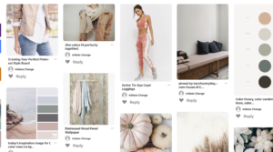
Step 2 – Pick out 5-6 colors
Now that you have all of your pictures, you are going to pick out 5-6 colors for your color palette. While choosing the colors for your color palette make sure you choose both light and dark tones. A strong color palette has a nice mix of light, dark, bright and muted colors so that you have some versatility when you create your website or marketing materials.
Play with your colors by adding black or white to change the shade for more contrasting colors.
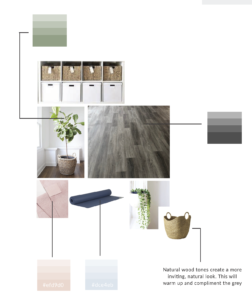
You can gather inspiration from Adobe Colors CC or coolors.co to help you pick out color palette that resonate with your brand.
Step 3 – Choose your dominant and accent colors
Although you have 5-6 colors in your color palette, you do not have to use every single one for every marketing collateral, ad, etc. Pick 1-3 colors to use as your dominant color so that you can start to create recognition across all of your platforms.
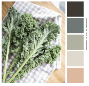
Now what?
How to use this color palette on your website
The dominant colors are going to be the two colors you use most throughout your website. You’ll bring out these colors in pictures, backgrounds, as headings and anywhere throughout your website.
Your accent colors can be used in buttons or other subtle ways throughout your website, but it’s important to identify your brand with your dominant colors.
Other places you can use your dominant and accent colors other than your website
Business cards, thank you cards, letter head, social media, Pinterest, powerpoint templates, Facebook ads, webinars.
I hope this was helpful in creating your unique color palette for your brand. Next week I’ll be sharing how to pick fonts for your website, so be sure to check back in!
If you never want to miss a blog post, join the Current Community so you’re always up to date with the latest website and business trends.
Have questions? Head on over to Instagram where we’re talking ALL about color and how to apply it to your website!
February 25, 2019
