

This year I’ve had the pleasure of designing many websites for a variety of different brands that are ready to either take their online presence up a notch, or create a new one all together.
Whether new clients have an existing website or not, there are common themes I notice that are ever present, no matter the variety of different types of businesses I work with.
Now, when you’re first starting a business It’s a big deal to invest in custom website design, so today I’m sharing the top 5 most common mistakes I see on websites so you don’t make these mistakes too.
Relatable blog posts:
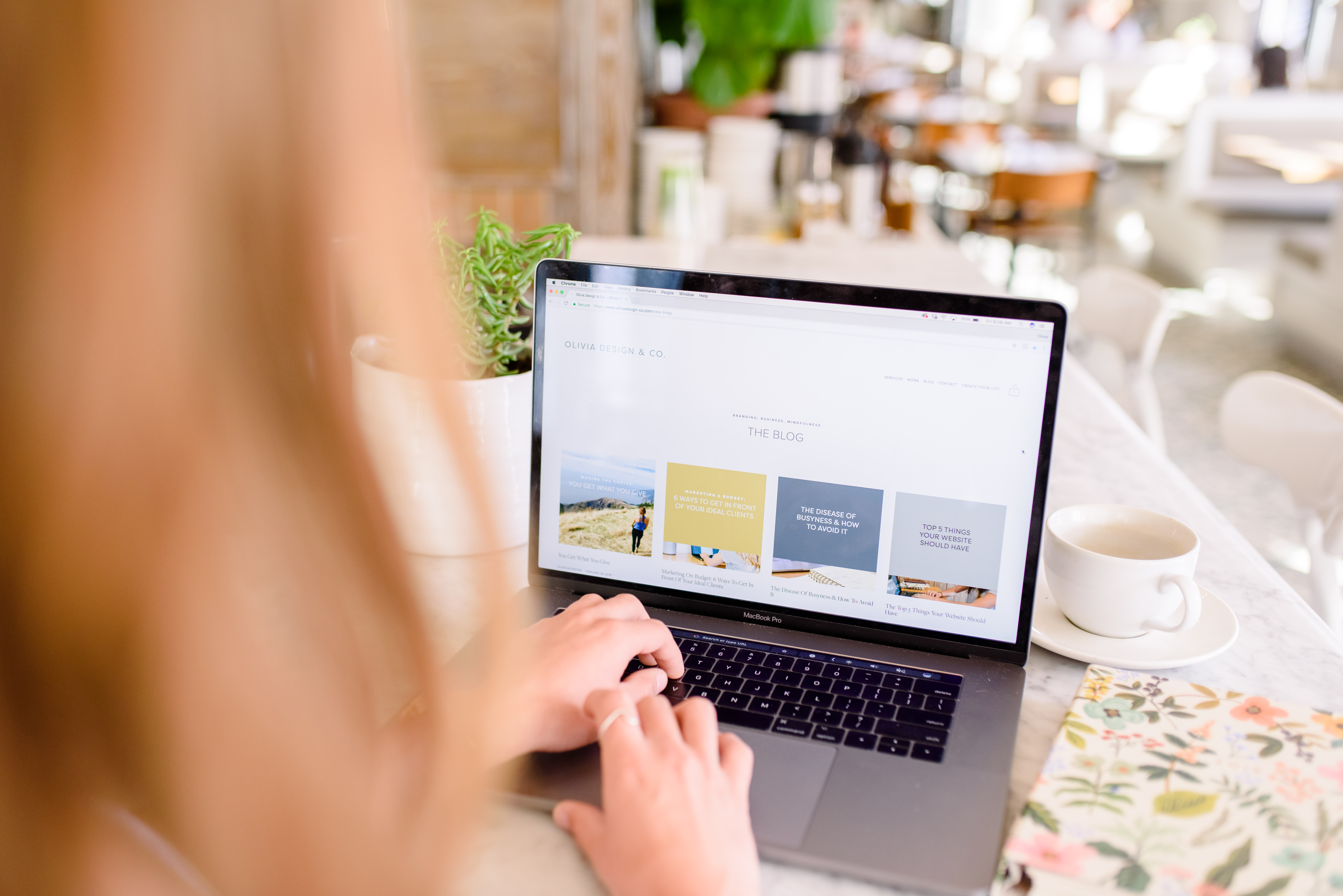
The Top 5 Things Your Website Should Have
5 Ways to Brand Your SquareSpace Site
You can also download your ultimate website design checklist to make sure you’re checking everything you need to have a website that converts off the list! It’s Free!
Mistake #1: Too many options in the main navigation
A mistake I often see is too many options in the main navigation to where it’s confusing for the visitor to find out about you and your business. When a new visitor comes to your website there’s no reason they shouldn’t be able to figure out who you are, what you offer and how they contact you within the first 30 seconds.
There are a lot of great templates out there you can be using for your website, but It’s not enough to have just a beautiful website, it has to be functional too.
How to solve this:
I usually suggest between 4 – 5 menu options, which should consist of:
- About
- Services
- Contact
- Extra (blog, shop, etc.)
It should only take 1-2 clicks for the visitor to get to wherever they need to go on your website. The longer it takes them to find what they’re looking for, the more of a chance you have to lose them, which is the opposite of what you want!
Download your website design checklist to get more in detail on your navigation!
Mistake #2: Using only stock photos & no photos of yourself
There are some really awesome websites out there that allow you to download free stock photos like unsplash.com and pixels.com, but when a website ONLY consists of these images, it doesn’t show off the personality of your brand (because everyone else has these images too).
YOU are the unique factor in your brand and people like your business because they like you – so show yourself off! If you have photos of yourself around your website, visitors will make a connection with you and every time they see your work (all over the internet) they can make that connection with you.
How to solve this:
- Option 1: Trade services with a friend whose a photographer or has a nice camera and get some nice photos taken for your website – it goes a LONGGG way!
- Option 2: Invest. To me, investing in professional photos is SO worth it because it builds cohesiveness in your brand, connects to your visitors and you can use them on multiple platforms. I wrote an Instagram post here with some tips on using professional photos
- Option 3: Photos are so important to me that when you work with me for a brand and website design, I put together a photo style book and help you to find the perfect photographer for your brand (no matter where you are in the world!) For my San Diego peeps, I’ve joined forces with a great photographer who gives my clients a special rate on her AH-MAZING packages!
Mistake #3: Confusing messaging
How many times have you gone to a website and asked yourself, “…but what do they do?” Unfortunately, one too many and I do not want you to be one of those people.
So, what does confusing messaging even mean?
Honestly, I made it up, but to me it means that your messaging doesn’t make sense and is different across multiple pages. I see it too often where people miss the opportunity to deliver a clear and concise message to their visitors.
The best thing about a custom website, is that you get to tell your website visitors what they should know about your brand so take advantage!
How to solve this:
Home page: Your home page messaging should go exactly in this order.
- Short tagline, i.e. “custom brand and website design for creative businesses”
- Summary of business, i.e. “Olivia Design & co. Designs authentic, purpose-driven brands for creative businesses”
- Services that you offer and an option to see more
Other pages: Your other pages should be similar and should have all of this information and in this order
- Title, i.e. “custom brand & website design”
- About, I.e. “together we’ll create a custom brand & website that attracts your ideal client & converts to sales.
- What you’re offering, i.e. what consists of your packages, how you can help the client, what problem you’re solving.
- Contact
Mistake #4: No portfolio or testimonials from ideal clients
As I said earlier, your website is an opportunity to explain to visitors exactly what you want them to know, yet when I’m redesigning websites and clients say their ideal customer is in the health & wellness space but their portfolio is filled with CPA’s and marketing consultants, it’s extremely confusing for everyone involved.
You want you ideal customer to come to your website and make an immediate connection that you’re the best person for the job, but if your testimonials and portfolio are not filled with your ideal clients, then you’re going to keep not getting the clients you want and turning away the clients that you do want.
How to solve this:
- Gather testimonials from all of your ideal clients. If you haven’t had any clients yet, do some trial work on friends and ask them for testimonials to add to your website.
- Create a portfolio that only attracts your ideal customers. For example, if you’re a health coach that only wants to work with athletes, design your portfolio with only that type of work.
By designing your portfolio with only the type of work you want to do, you’re show casing your expertise to enhance your connection with your ideal customer.
Mistake #5: Not giving away free information
This might sound a little crazy, but hear me out. I’m not saying to give away all of your secret information (that should be saved for your amazing clients), but in order to gain the trust of your visitors, you have to show off your expertise. This could mean an email opt in, a blog, a shop, anything that could gain loyalty from a visitor and keep them coming back.
When you create a website people aren’t going to magically appear there, and having this extra information can enhance your traffic, which could in turn convert to sales.
How to solve this:
- Blog: This is the best way to share information and reach a wide variety of audience to get more traffic to your website. Once you start blogging and release information once a week, you’ll start to gain a following that continues to come back to your site regularly.
- Email opt in: Not into blogging? No big deal, create a one time opt in so when people come to your website, they can download this opt in that shows your expertise. For example, if you’re a nutritionist you can create an opt in with your top 5 favorite recipes. It’s a one time thing for you to sit down and do AND you get their emails – it’s a win-win.
I hope these help you to design a website that’s both beautiful and functional! If you’d like to work together to design a brand & website that converts to sales contact me here, I’d LOVE to work with you!
August 27, 2018
