SquareSpace is an amazing platform that allows you to make a beautiful, simple website that showcases your business. If you don’t hire a brand designer to develop your website, there are countless templates that you can use to highlight your business.
Although SquareSpace templates are great, you want to add in your brand personality to really stand out and attract your ideal clients!
In this article i’m going to share 5 simple ways you can update your SquareSpace site to brand your website!
Fonts
Fonts are an awesome way to add some character to your website! Whether you have brand fonts or not, taking the time to find the right fonts that show your personality go a long way online.
To update your fonts, go to Design > Style Editor and you can choose from hundreds of different fonts to add to your site by clicking on the different paragraphs and changing them up. If you have custom fonts, watch this helpful tutorial here.

Also, if you have Adobe Typekit, you can add your typekit ID which is super helpful! You can find how to do that here.
Colors
Colors are another way to brand your SquareSpace site! To edit this you can also go in the style editor section of your website. If you don’t have brand colors, pick a range of 3-5 colors (some neutral, one or two bold) and add them around your site.
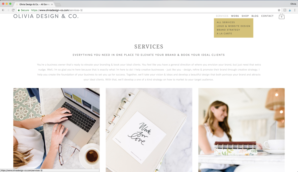
For example, notice how throughout my site I have a splash of yellow. Since it’s a bright color, I just add it around so it’s never too much.


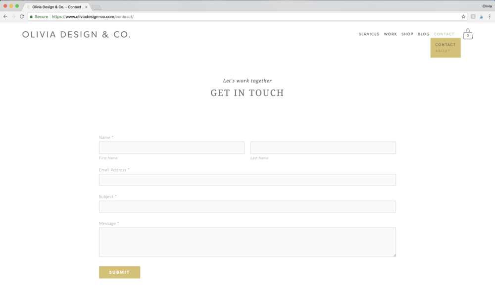
Places you can add your brand colors are, your footer, buttons, in images (we’ll talk about this next!), fonts or dropdowns.
Images
Having amazing, brand images are HUGE to branding your SquareSpace site. With brand photos your website looks professional and gives off the vibe of your personality to your future clients that are visiting your site.
Although stock websites are awesome, pictures truly bring your whole brand together! When you get professional photos taken, be sure to go to a place that works with your business and dress in your brand colors.

Also, by having the brand photos throughout your website, it’s easy for people to recognize you from one platform to another. For example, you can see below that I have the same “about me” photo on all of my platforms which makes it convenient for visitors to know that it’s me on all platforms.
Graphics/Icons
Graphics are another great way to add your brand personality to your SquareSpace site! They are an added impressive element that make it easier for someone to identify your brand, as well as, look professional.
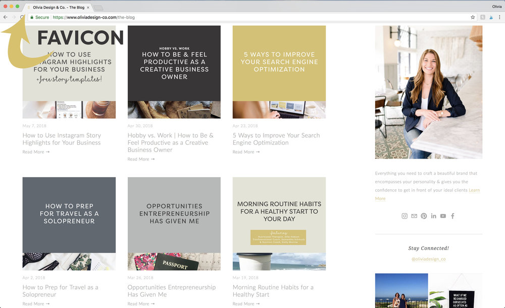
One easy way to do this is by adding a favicon. A favicon is the graphic that’s at the top left next to your domain. To add this go to design > logo and title.

Messaging
Last, but certainly not least, messaging is a major way to tie your brand into your SquareSpace site. Having a catchy tagline right as someone arrives at your site to say exactly what you do and gets their attention.
When someone connects to your story, purpose and mission, you are more likely to make perfect business partners, which hopefully in turn makes a new client!
I hope this was helpful in explaining ways to brand your SquareSpace site! If you have any questions, feel free to contact me!
May 14, 2018